Mavenlink - 2018
The Operational System of Record for agencies and service organizations.
Our effort from the principal rebrand of 3 years prior had propelled our young company. We hit out growth targets each year, doubled our workforce, and secured a $39M Series D funding round from Goldman Sachs. With this growth came new challenges, new competitors, and new target market segment.
As we continued to move upmarket, the customer needs were evolving. The hairball of technology systems customers were stitching together was creating inefficiencies, incomplete data, and poor visibility. Customers couldn’t scale. Mavenlink was the answer.
This jolt in company trajectory necessitated a rebranding effort.
Working with their creative leader, I helped developed a robust visual design system that reflected the sharpened positioning and refined voice.
Over the next several years, I worked alongside the marketing team to create end-to-end solutions that consistently achieved set out goals.

Branding
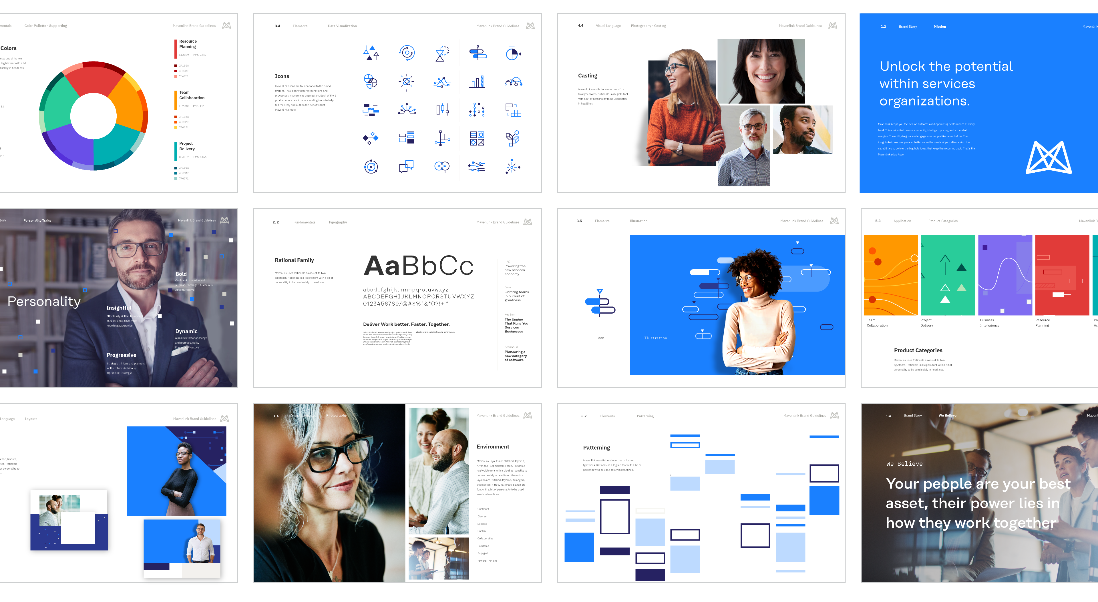
Our new positioning was unifying business systems to enable the insights and agility you need to grow and scale. We developed a visual identity system that centered around the themes of systems, data, intelligence, and transformation. Built around a distinctive icon and patterning system against a backdrop of overlapping and stitched color blocks, the visual identity was bold, striking and memorable.
My Role
Visual Identity, Brand Guidelines, Iconography
Credits
John Reese – SVP Marketing, Aaron Pedroza – Creative Director, Javier Garcia, Warren Harper – Designers, Jennifer Dodos – VP Marketing Communications, John Shockey — Developer
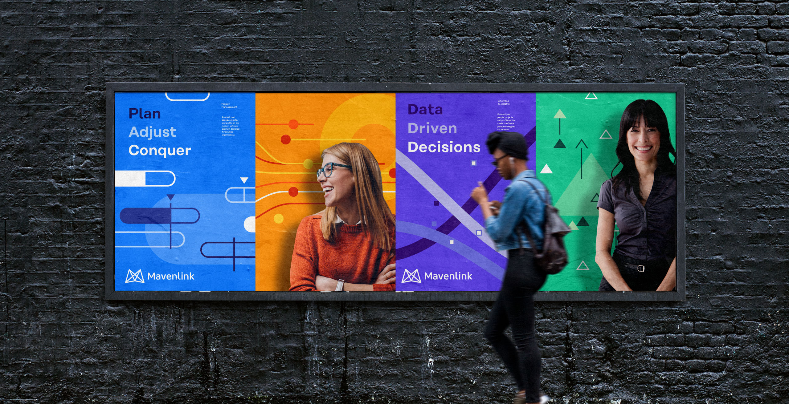

Marketing
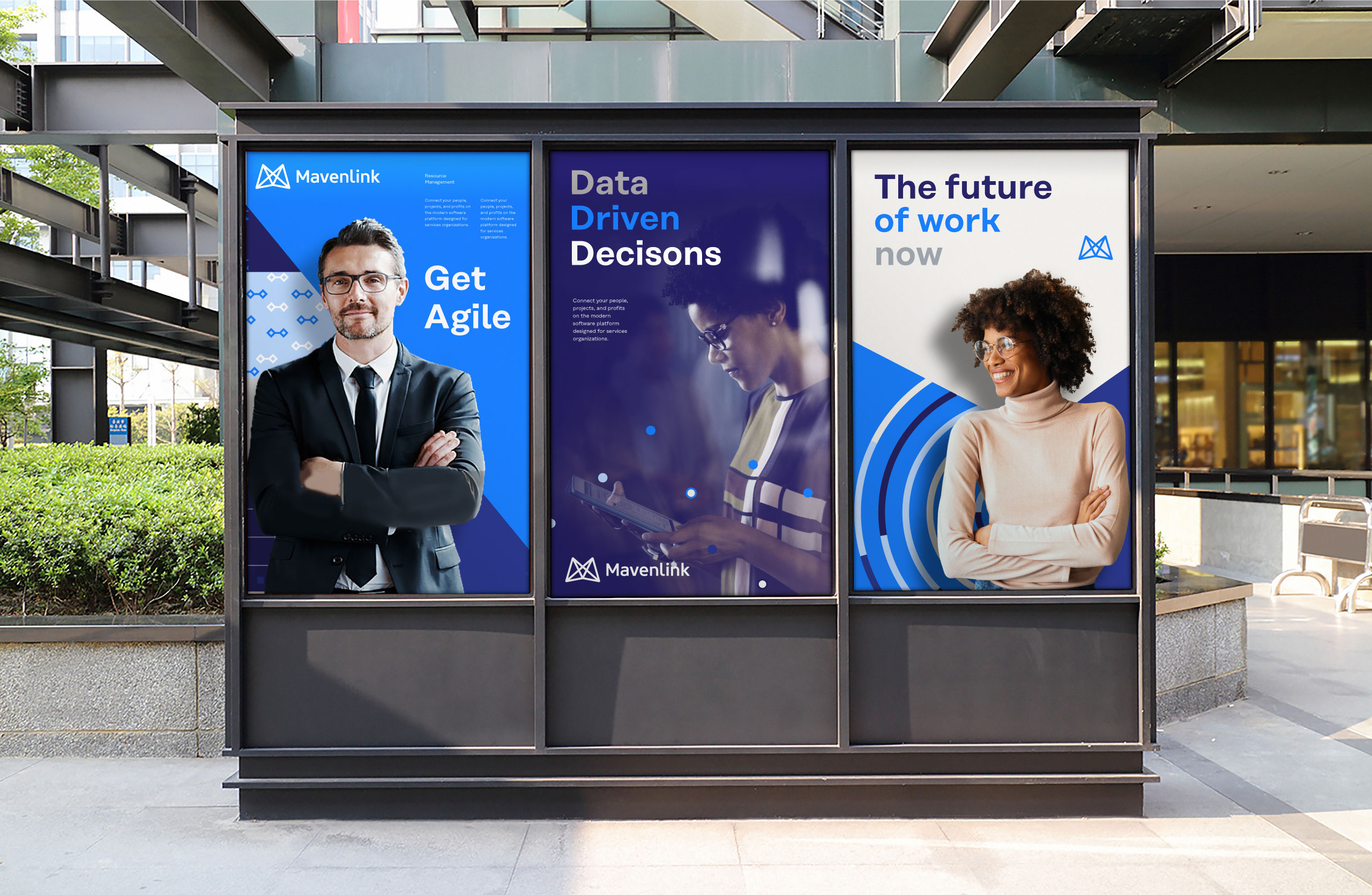
We leveraged the visual identity system across all communications. It was an extraordinarily flexible and dynamic system with a great backbone of rules and assets to keep the designs fresh.
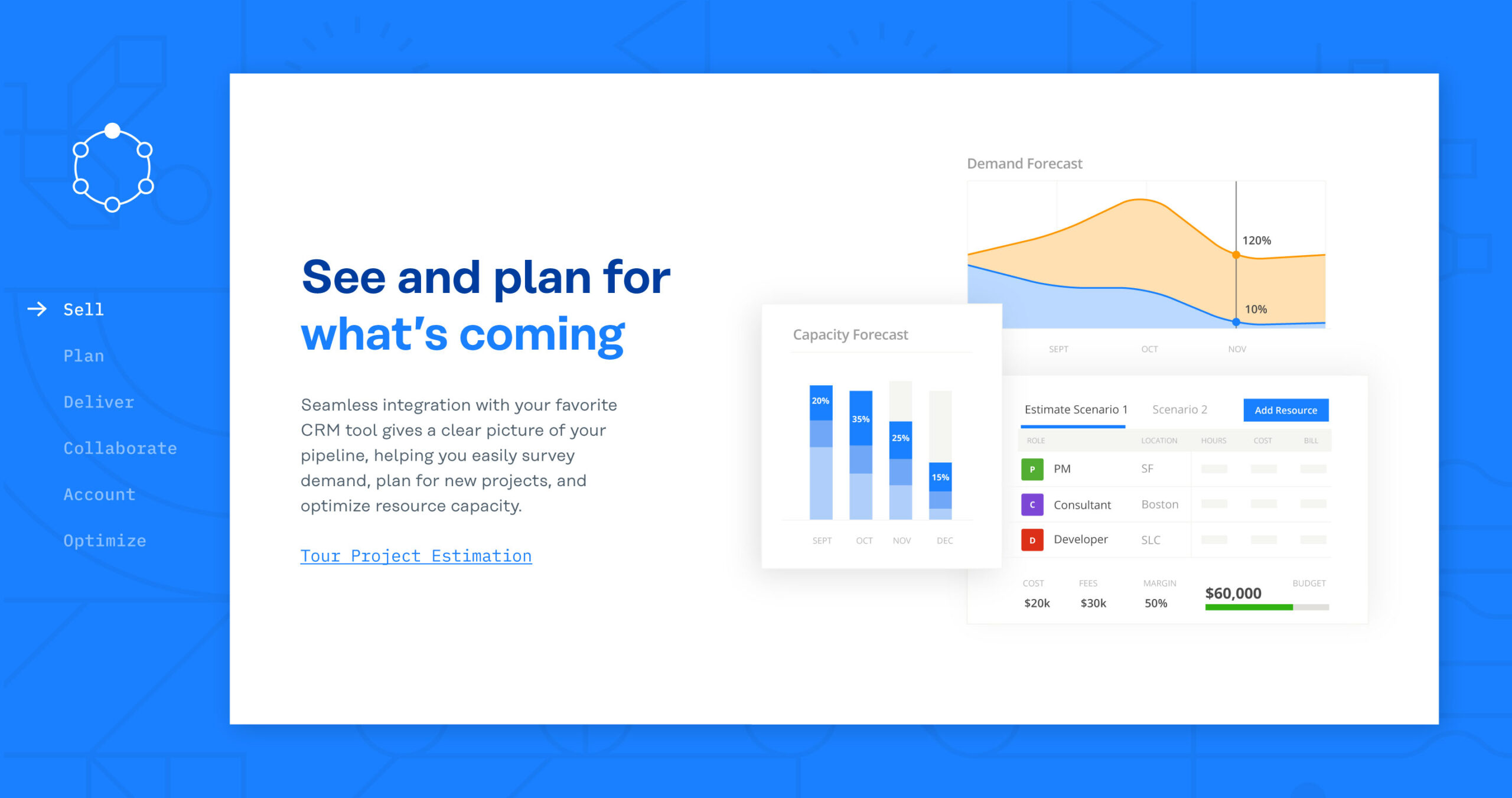
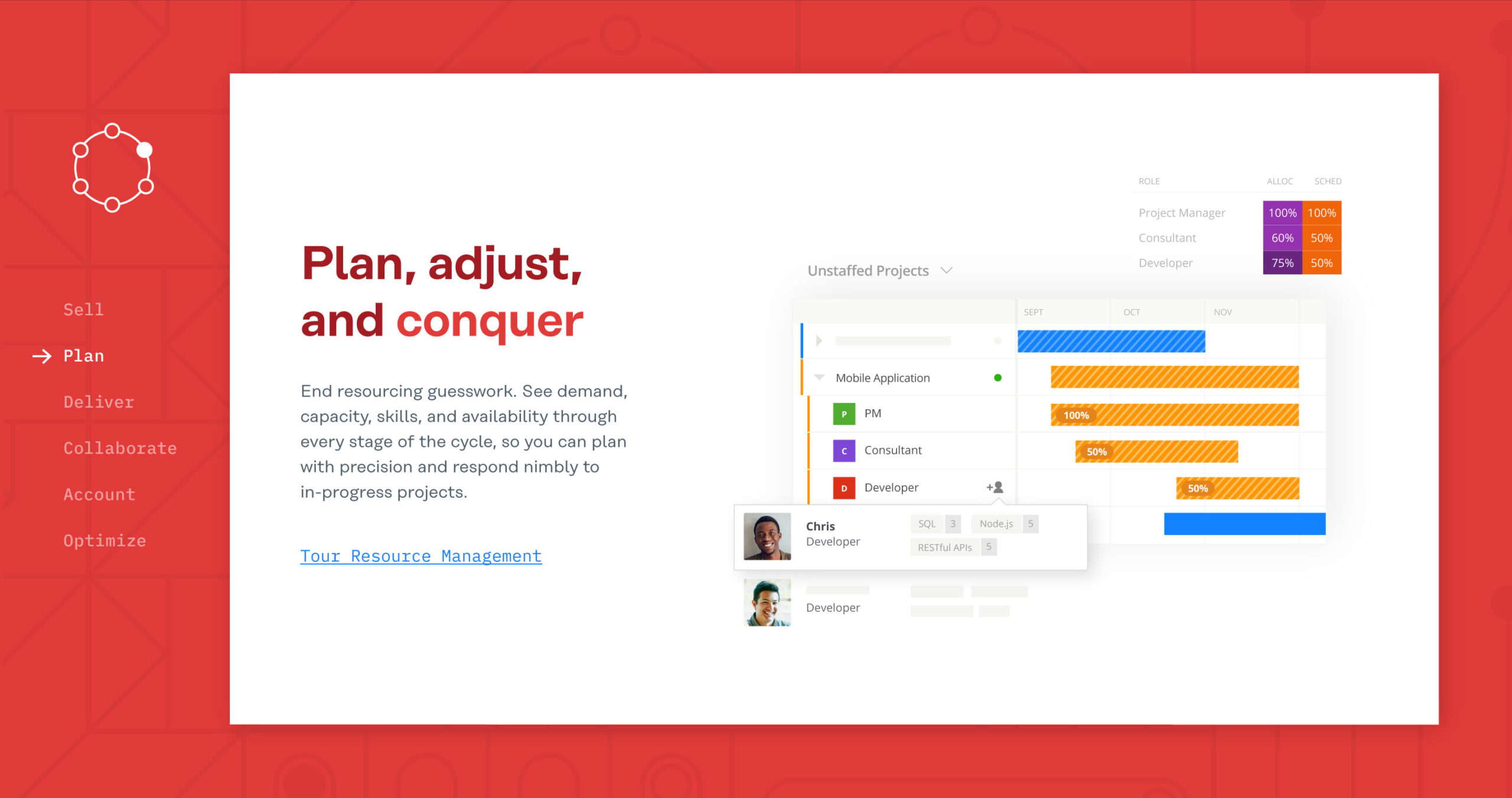
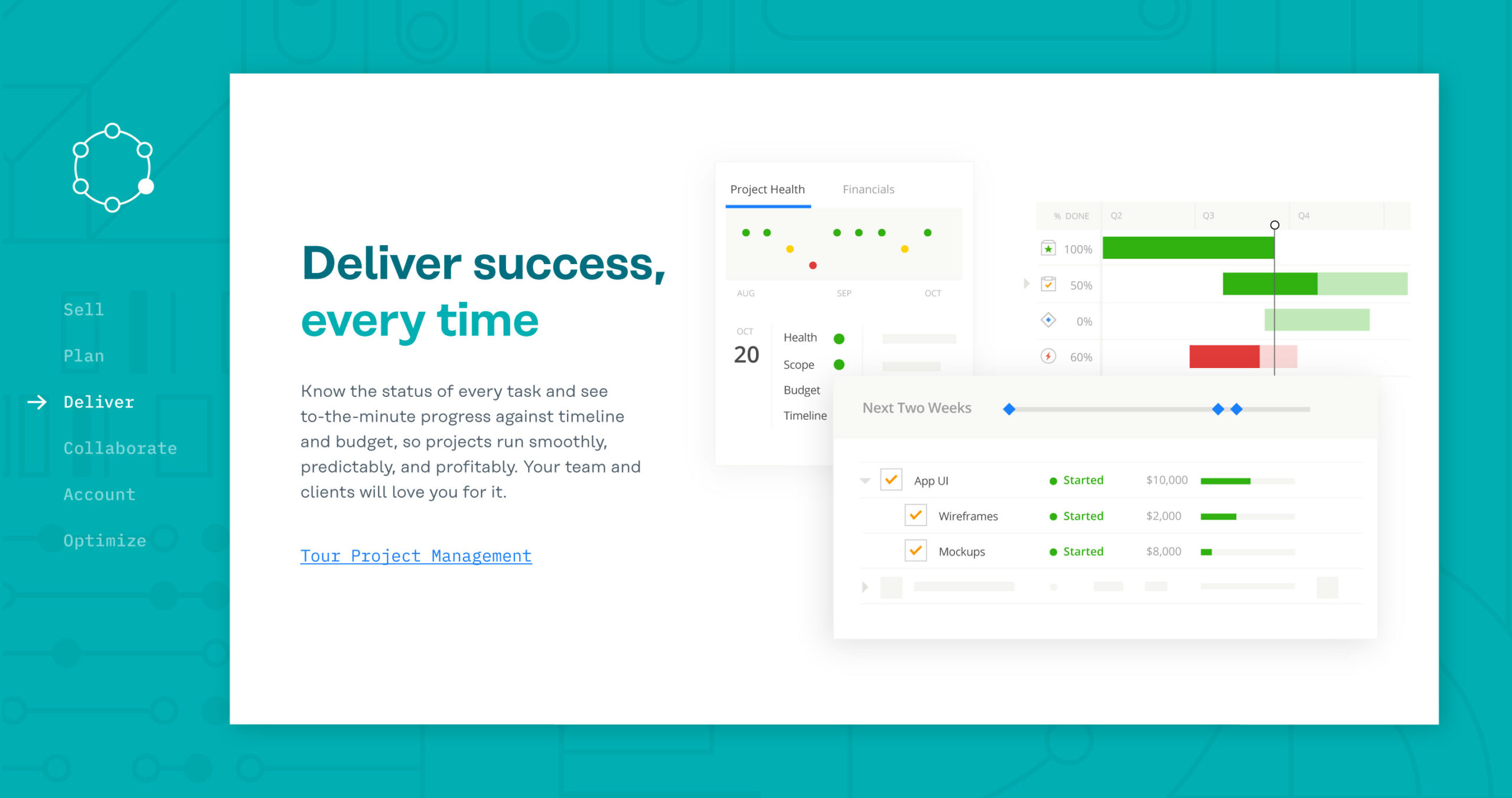
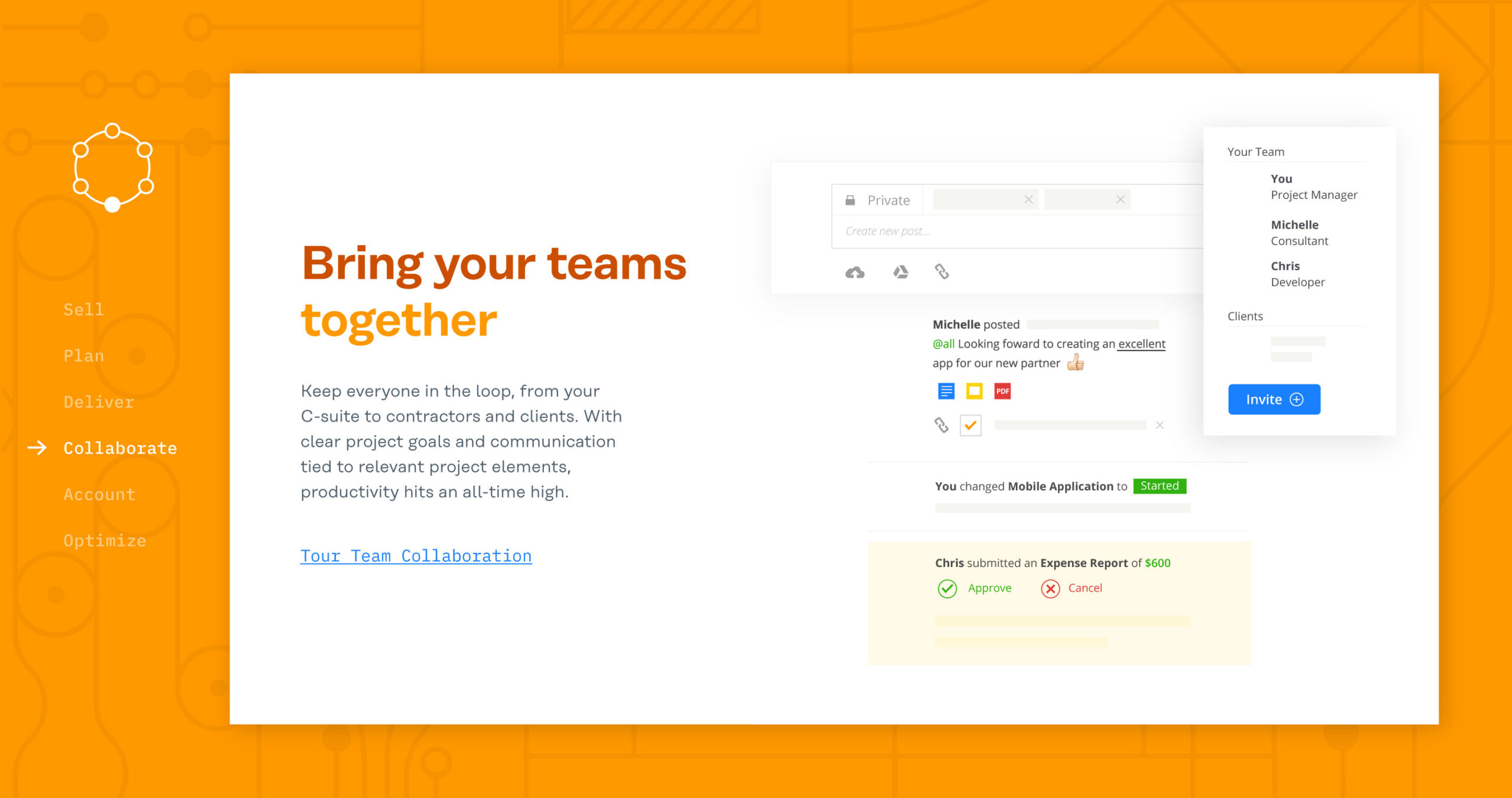
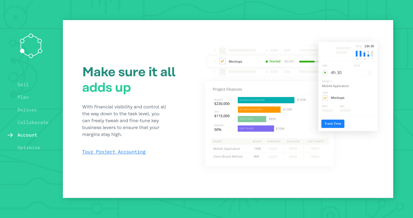
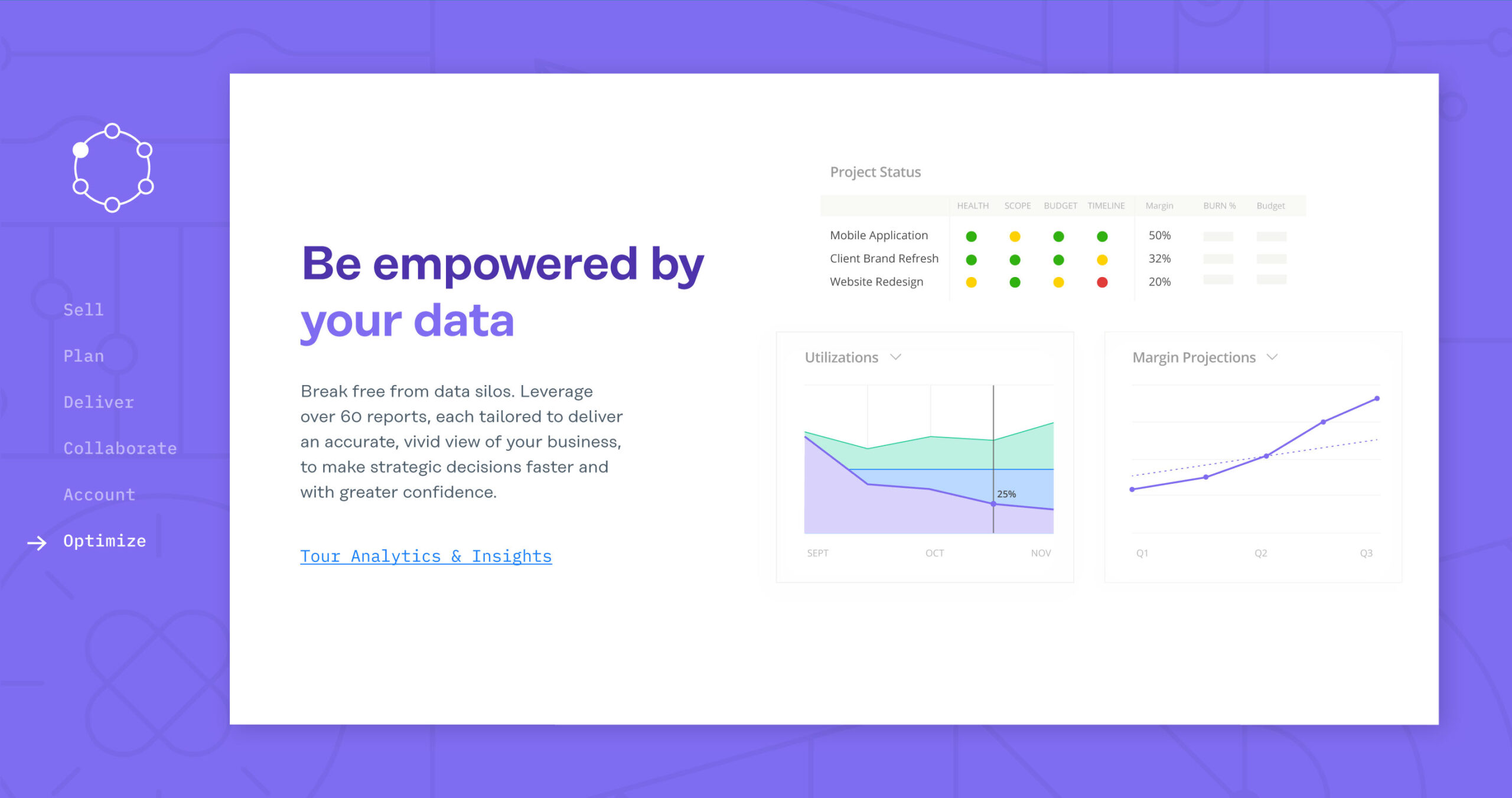
Each of the 5 product modules had a color motif and a specific set of icons and patterns to bring some context and meaning to each product area. When we were talking specifically to a product area we used a category color and icon set. When we were talking about the Mavenlink platform—the combination of the 5 modules—we used a blue color palette and any of the icons.
My Role
Visual Design, Illustration, Production
Credits
John Reese – SVP Marketing, Aaron Pedroza — Creative Director, Jennifer Dodos – VP Marketing Communications, Sara Kunz – Sr. Designer, Kavon Zamanian – Motion Designer, Matt Draper – Copywriting, Hunter Pollard – Director of Demand Generation, Ryan Montano – Director Product Marketing

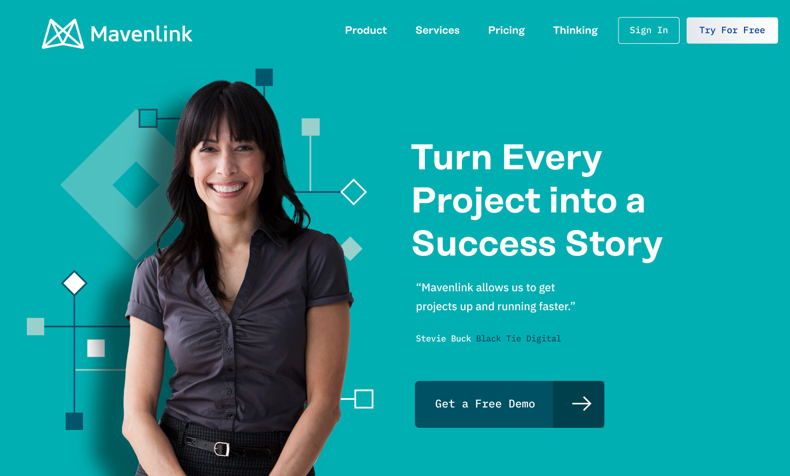
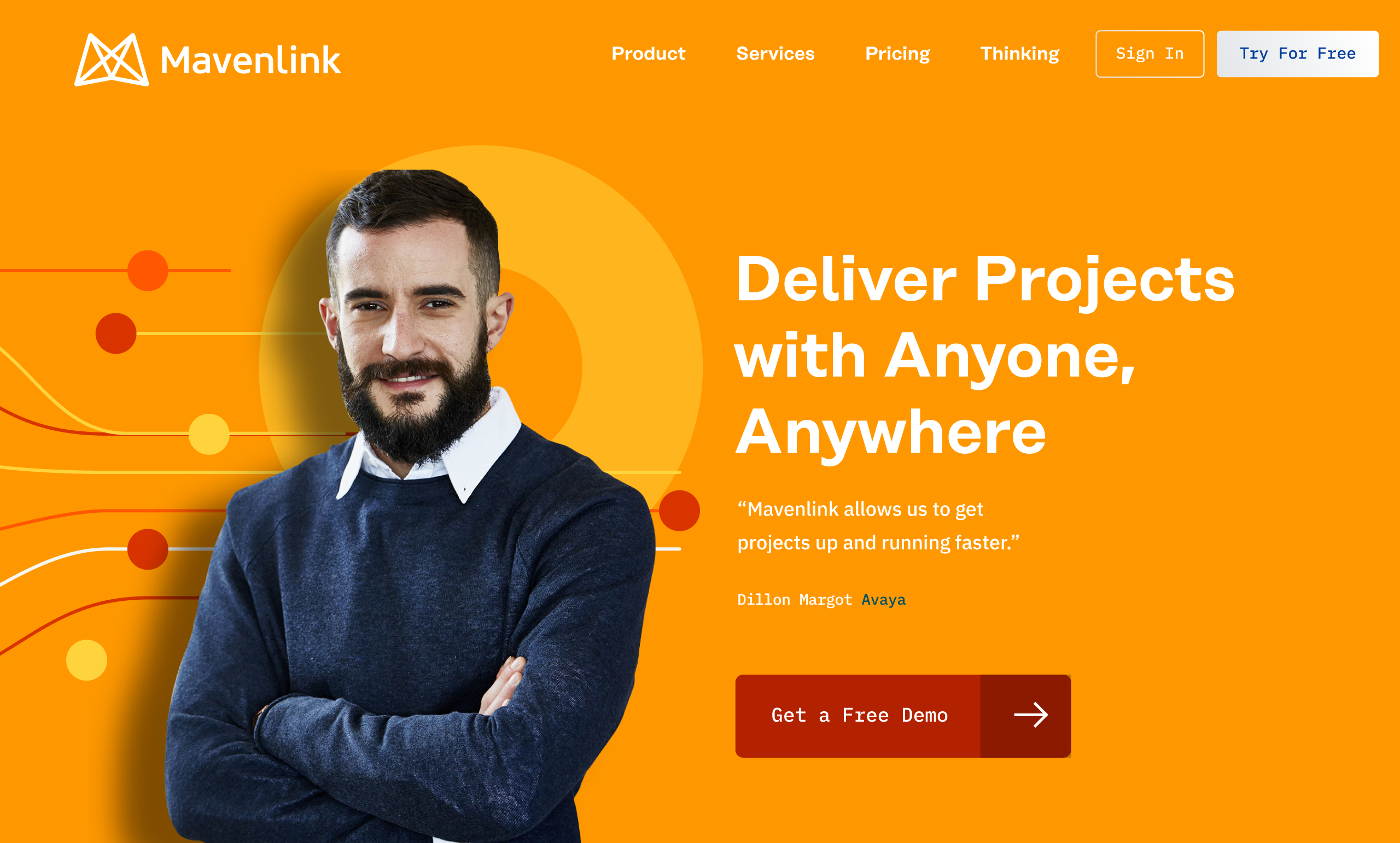
Mavenlink.com
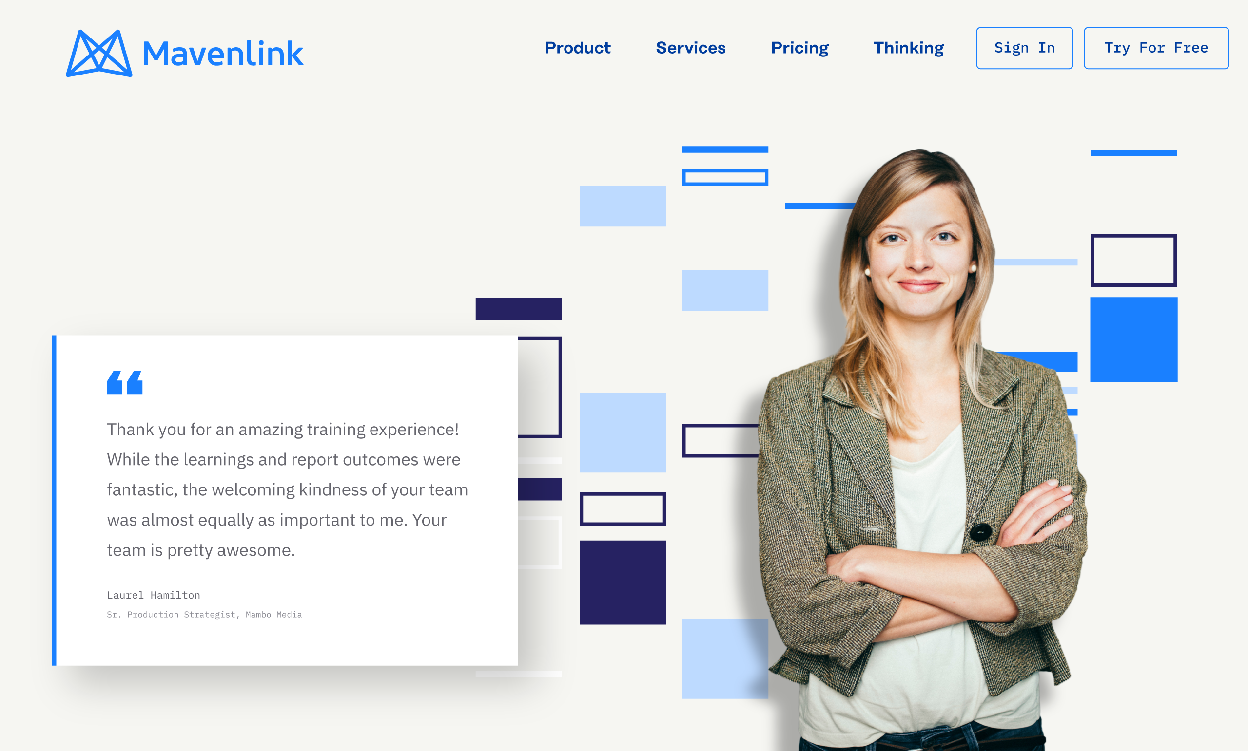
Our website was confident, eye catching and most importantly, aligned to the new positioning around unifying systems, confidence and control. We leveraged a number of interactive experiences across the site to tell immersive stories around our positioning, product, and services.
My Role
Visual Design, User Experience, Illustration
Credits
Sara Kunz, Zhenya Rynzhuk – Designers, John Reese – SVP Marketing, Jennifer Dodos – VP Marketing Communications, Toni Pace – Website Manager, Matt Draper, Brandon Getty – Copywriting, Ashley Riegg, Dominique McBee – Design Operations, Ade Farquhar, John Shockey – Developers, Hunter Pollard – Director of Demand Generation, Ryan Montano – Director Product Marketing

Mavenlink GO
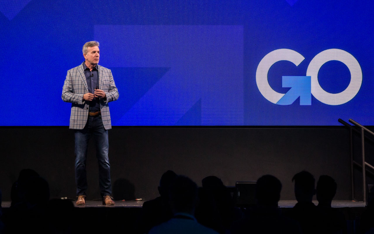
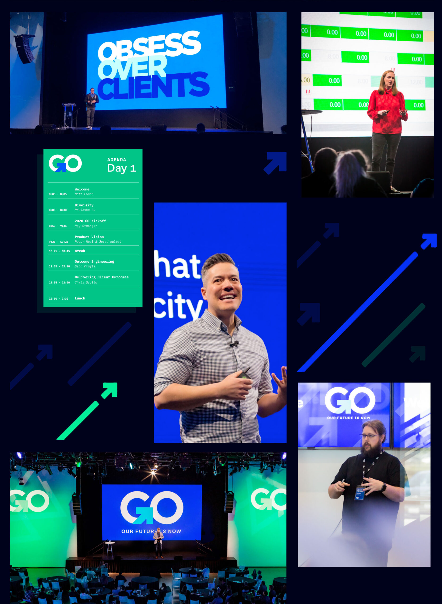
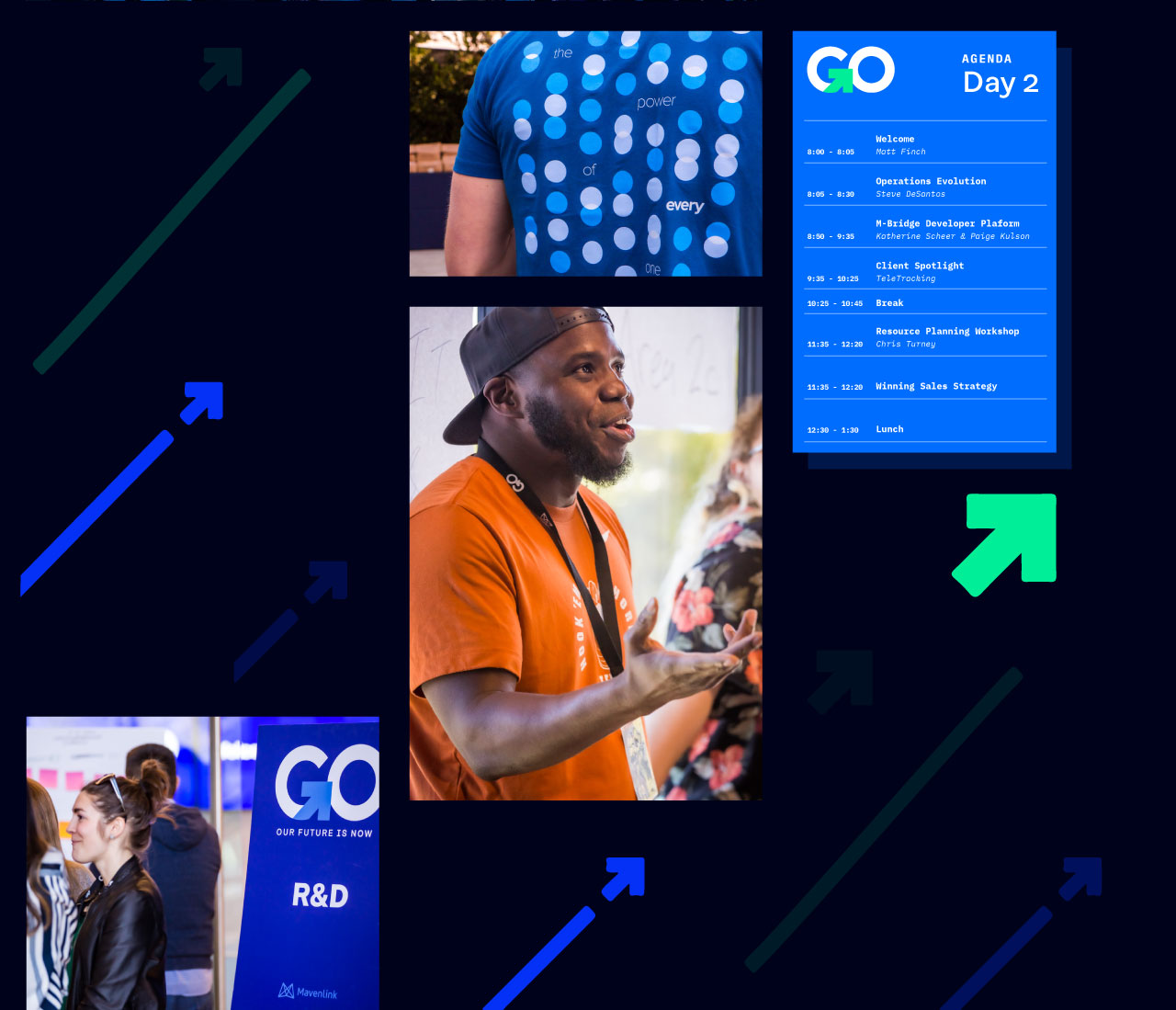
The annual company conference is named Mavenlink GO. It is a multi-day event to kickoff the fiscal year and energize the company with client spotlights, keynote speakers, demos, and presentations from across the company.
We developed the GO logo and the arrow branding that would be used year to year as well as the annual event themes: Obsess Over Clients and The Power of One.
My Role
Event Design & Execution, Live Production
Credits
Kavon Zamanian – Motion Designer, James Serazio – Event Manager, Jennifer Dodos – VP Marketing Communications
Integrated Campaigns
The marketing team launched integrated campaigns every quarter. They would align to broader strategies that delivered the thought leadership the market was looking for as well as setting up the themes, questions, and solutions that our product ultimately delivered while reinforcing the Mavenlink point-of-view.
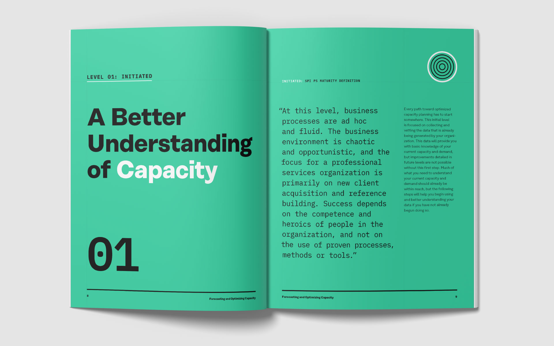
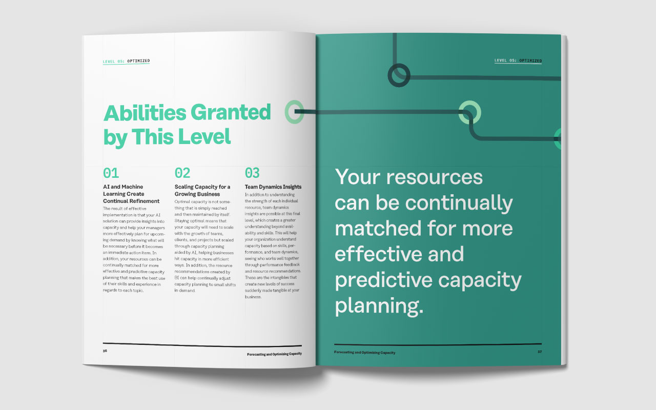
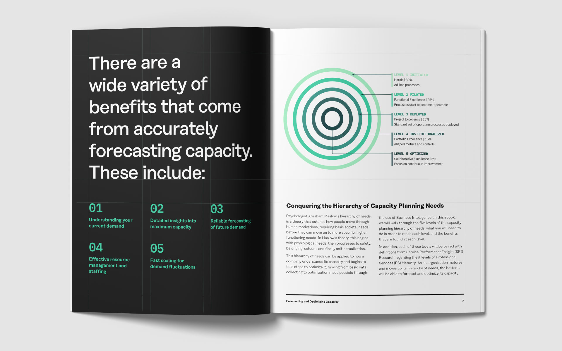
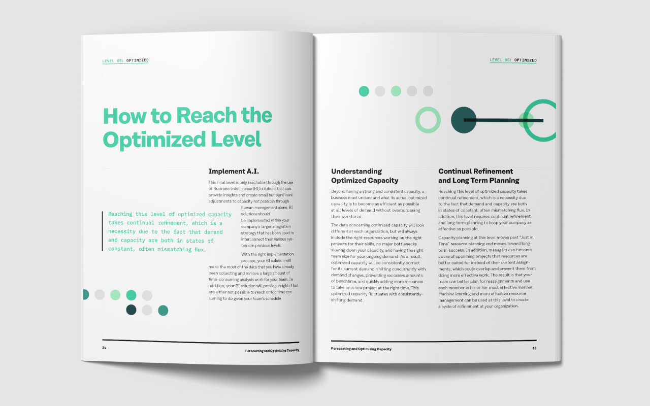
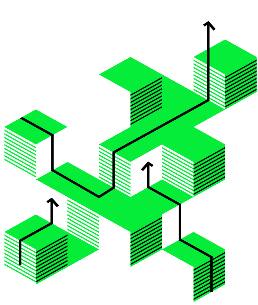
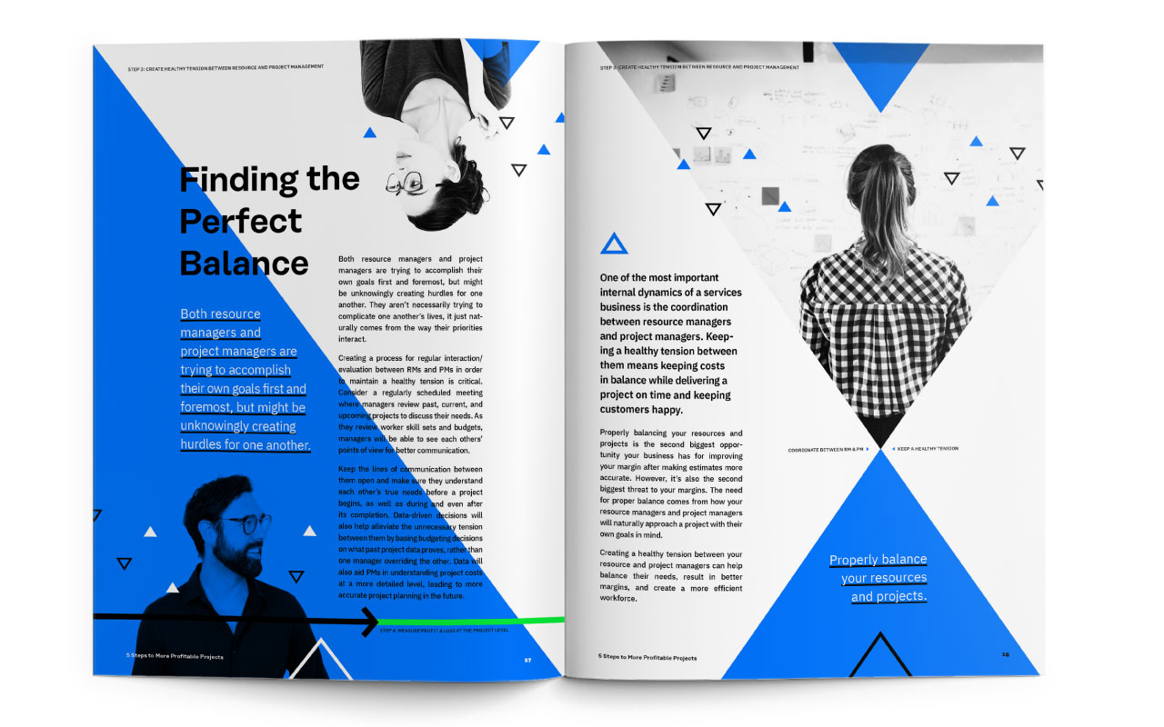
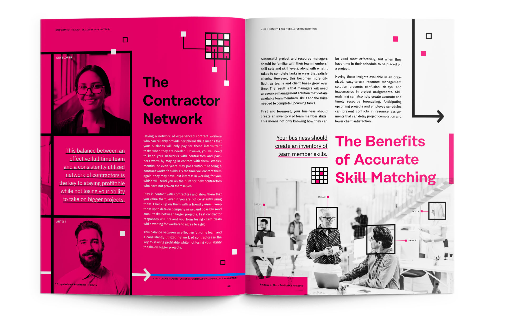
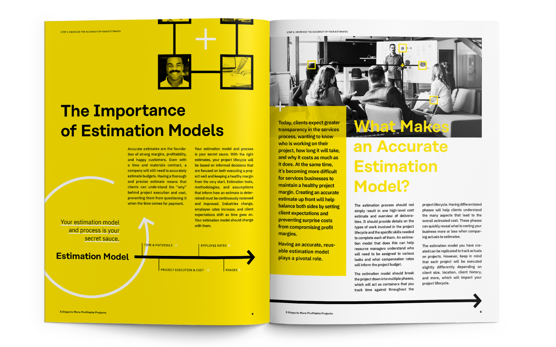
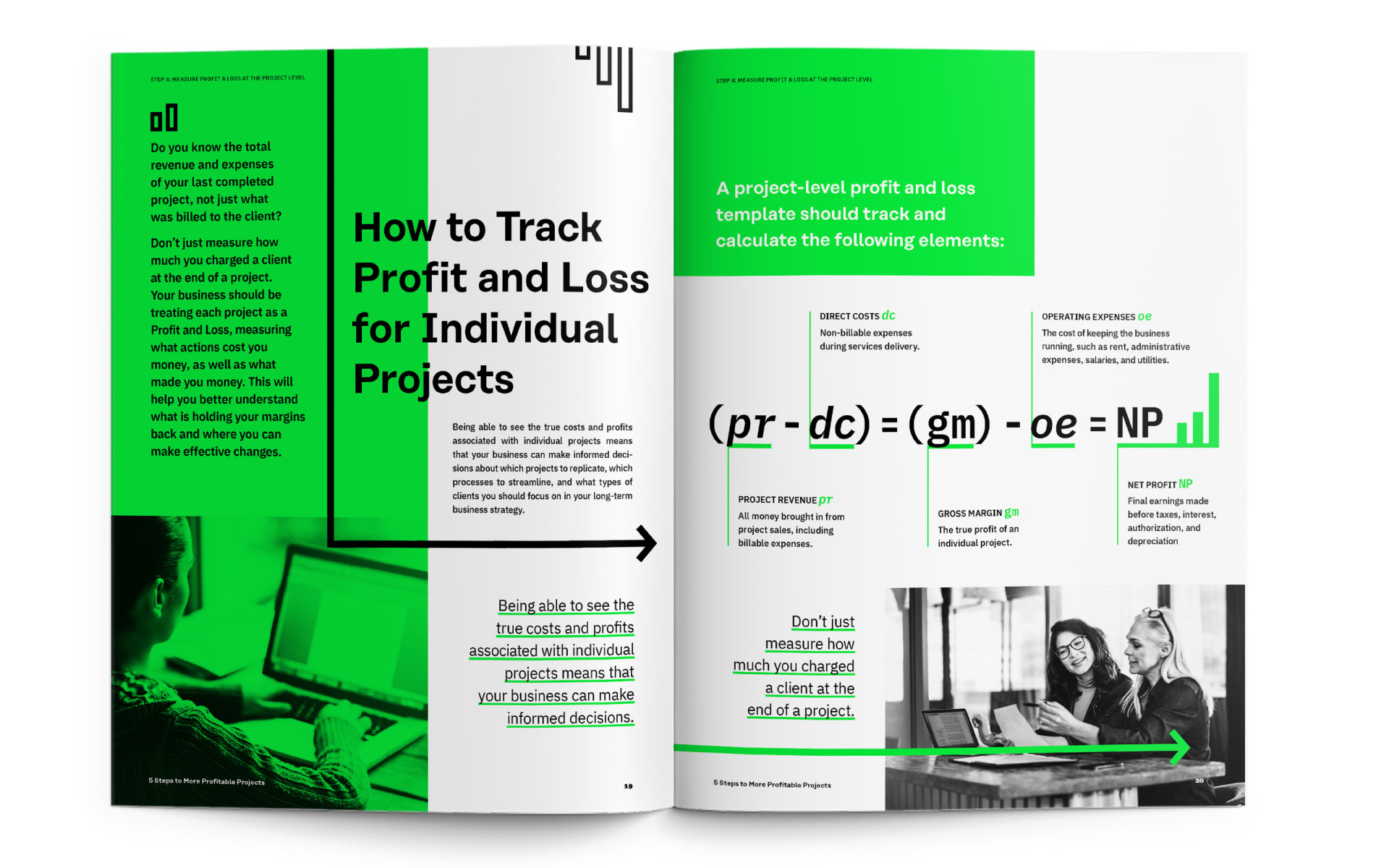
Each campaign was designed adjacent to the Mavenlink branding and had their own unique visual system. The branding and messaging were first designed as longform eBooks, microsites, and then leveraged across display advertising and other marketing touchpoints.
Integrated Campaigns
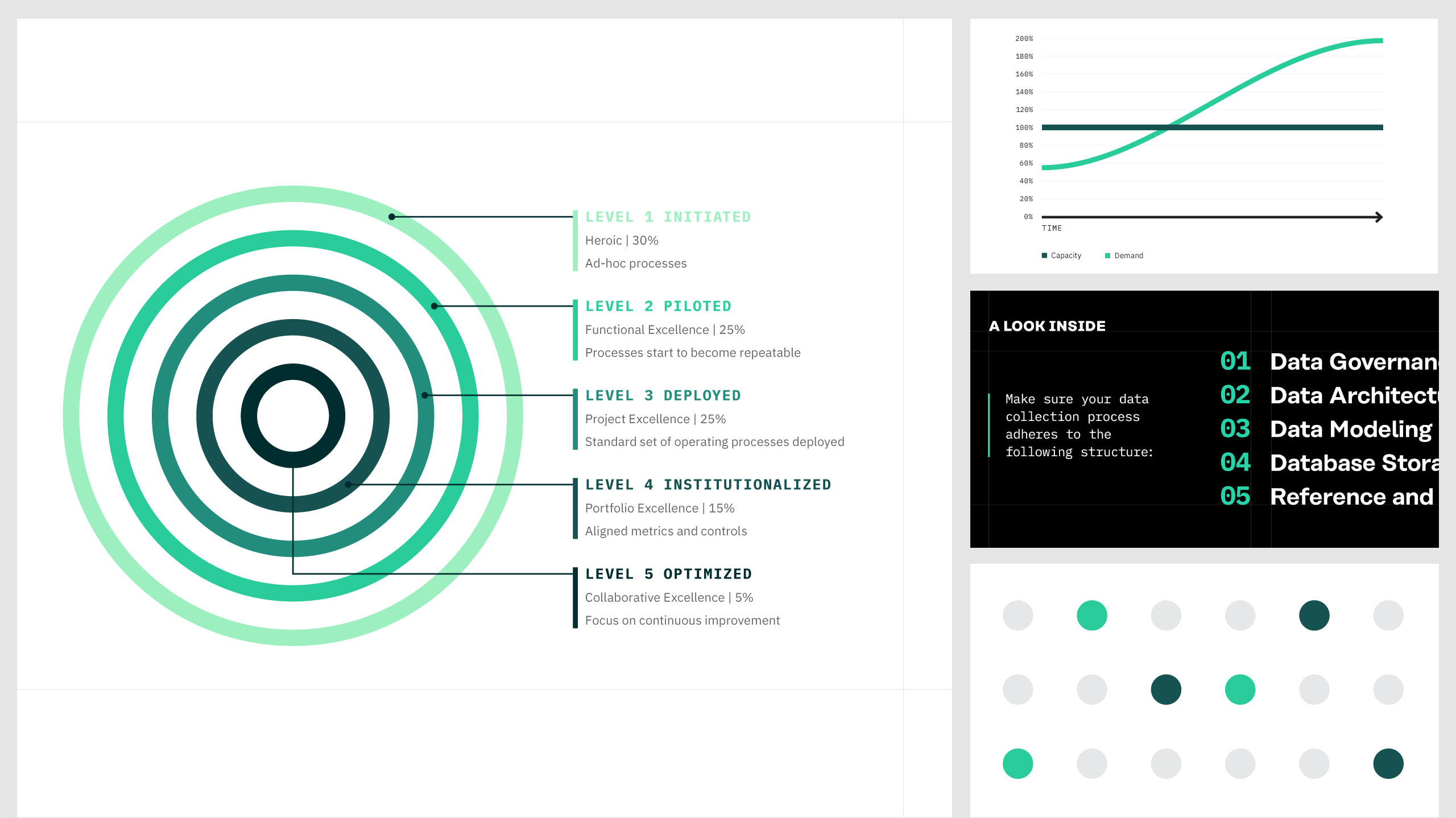
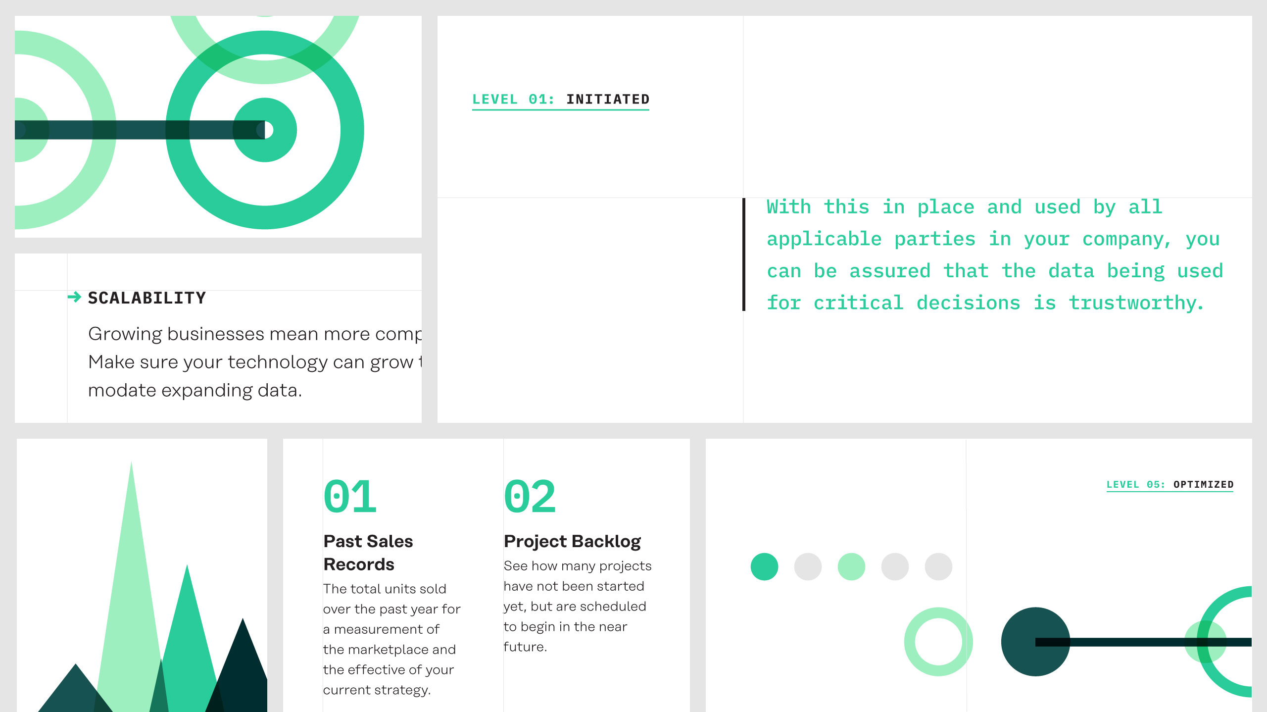
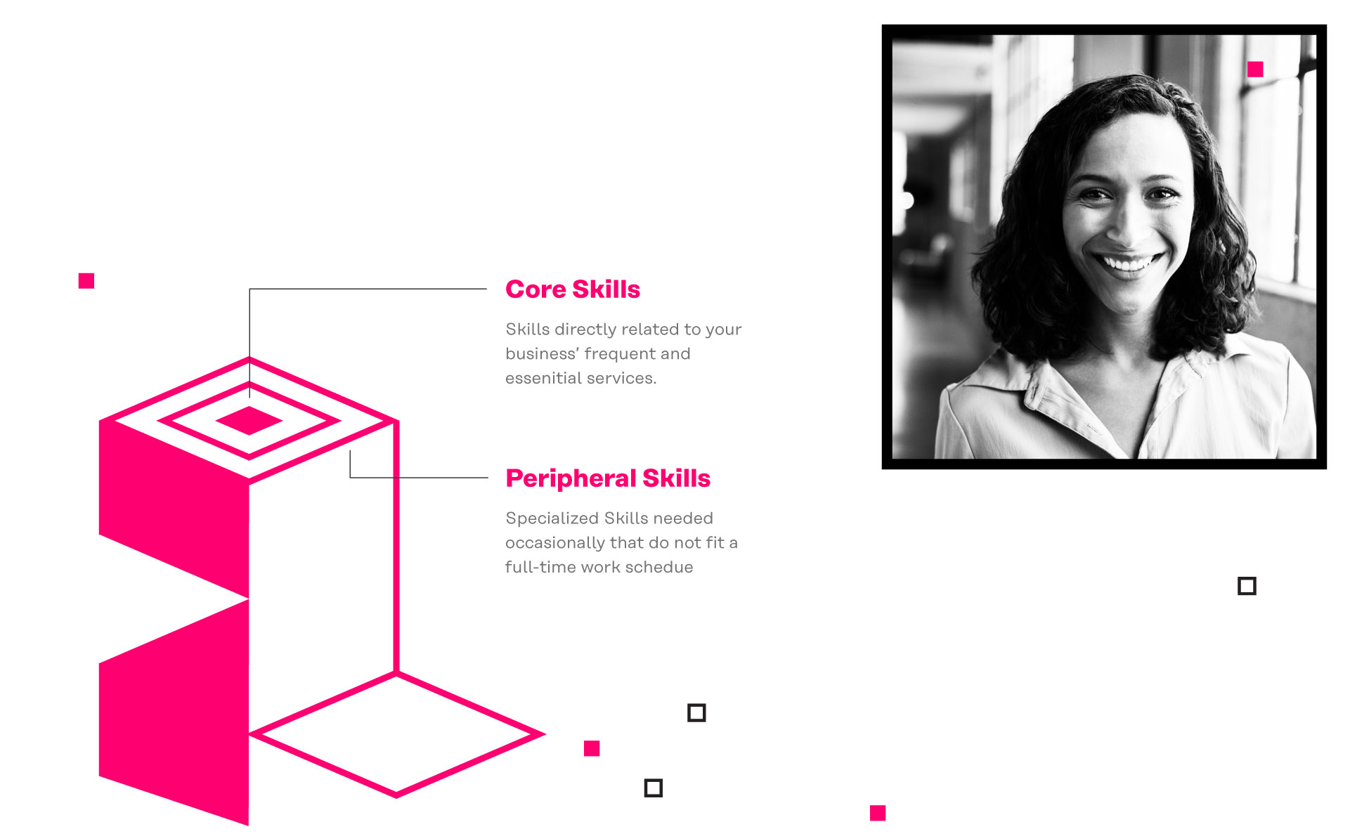
5 Steps to More Profitable Projects
My Role
Illustration, Layout Design, User Experience
Credits
Sara Kunz — Designer, Matt Draper – Copywriting, John Shockey – Developer, Toni Pace – Website Manager




Integrated Campaigns
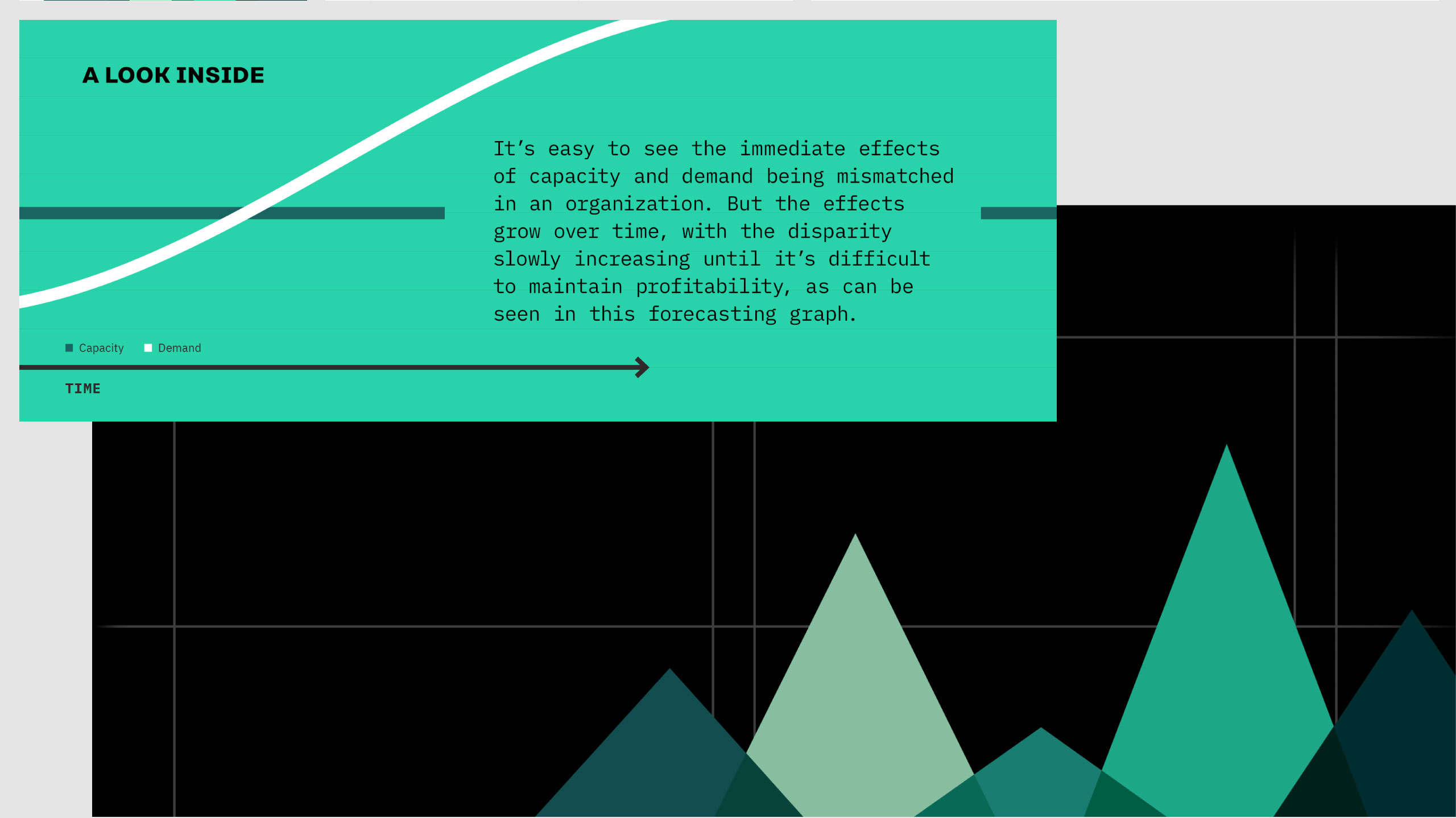
Forecasting & Optimizing Capacity
My Role
Visual Design, User Experience, Storyboarding
Credits
Sara Kunz – Illustrator, Matt Draper – Copywriting, John Shockey – Developer, Toni Pace – Website Manager
